Who is the user?
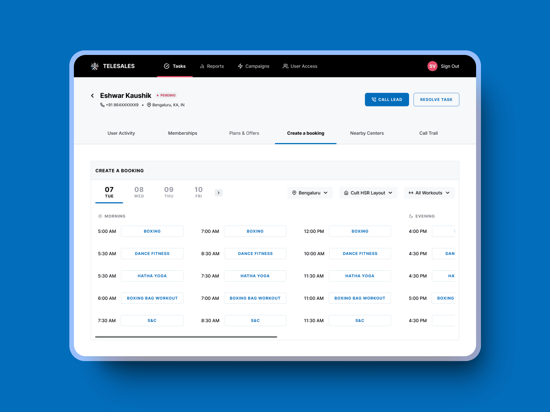
The primary users of this application are the sales representatives within the company. These professionals rely on the tool to engage with customers for various purposes, such as selling gym memberships, renewing existing subscriptions, and promoting other related services.
What was the problem?
The Telesales team had observed a concerning trend of declining sales performance on the platform. The decline in sales performance was evident through three main KPIs:
High Lead Expiry Rates
At the time, approximately 800 leads were expiring per week across all users on the platform.
Unsatisfactory Lead Attempt Rates
The attempt rate was only about 85% on average per user, with a goal to get as close to 100% as possible.
Reduced Conversions
Fewer leads were being converted into subscriptions, affecting overall sales performance.
Business and User Perspectives
Business Lens 🔎
The telesales team's performance directly impacted revenue since they sold subscriptions through the platform.
User Lens 🔎
The primary concern was whether the platform could effectively support the sales team in achieving their targets.
Facing Constraints
Like with any real-world project, there were a few constraints that I had to work around
Limited Development Bandwidth: I mostly had to work within the constraints of existing features and components.
Sparse Documentation: The previous version of the tool was poorly documented.
No Unified Design System: Internal tools lacked a standardized design approach
Turning Challenges into Opportunities
One big advantage I had was the direct access to users. I conducted seven comprehensive user interviews to dig into their workflows and pain points.
Key Research Learnings
Motivation 💪
The biggest motivator for users was hitting their sales targets.
Prioritization⏳
Users started their day by prioritizing follow-up leads.
External Dependency🔗
100% of our users maintained a separate Excel sheet to track their follow-ups, highlighting a need for better in-platform tracking.
Customized Pitches 📝
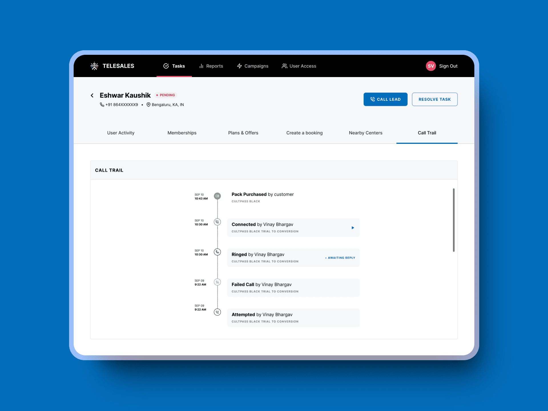
Users looked for previous customer interactions to tailor their pitches. They needed more comprehensive information at their fingertips.
Redesign Goals
Based on these insights, I set out with three clear goals for the redesign:
Streamline Decision-Making 💡
Offer comprehensive information about tasks and leads upfront.
Empower Users ✊
Provide real-time access to performance metrics.
Enhance Self-Sufficiency 💪
Integrate functionalities to minimize reliance on external tools.
Early Explorations
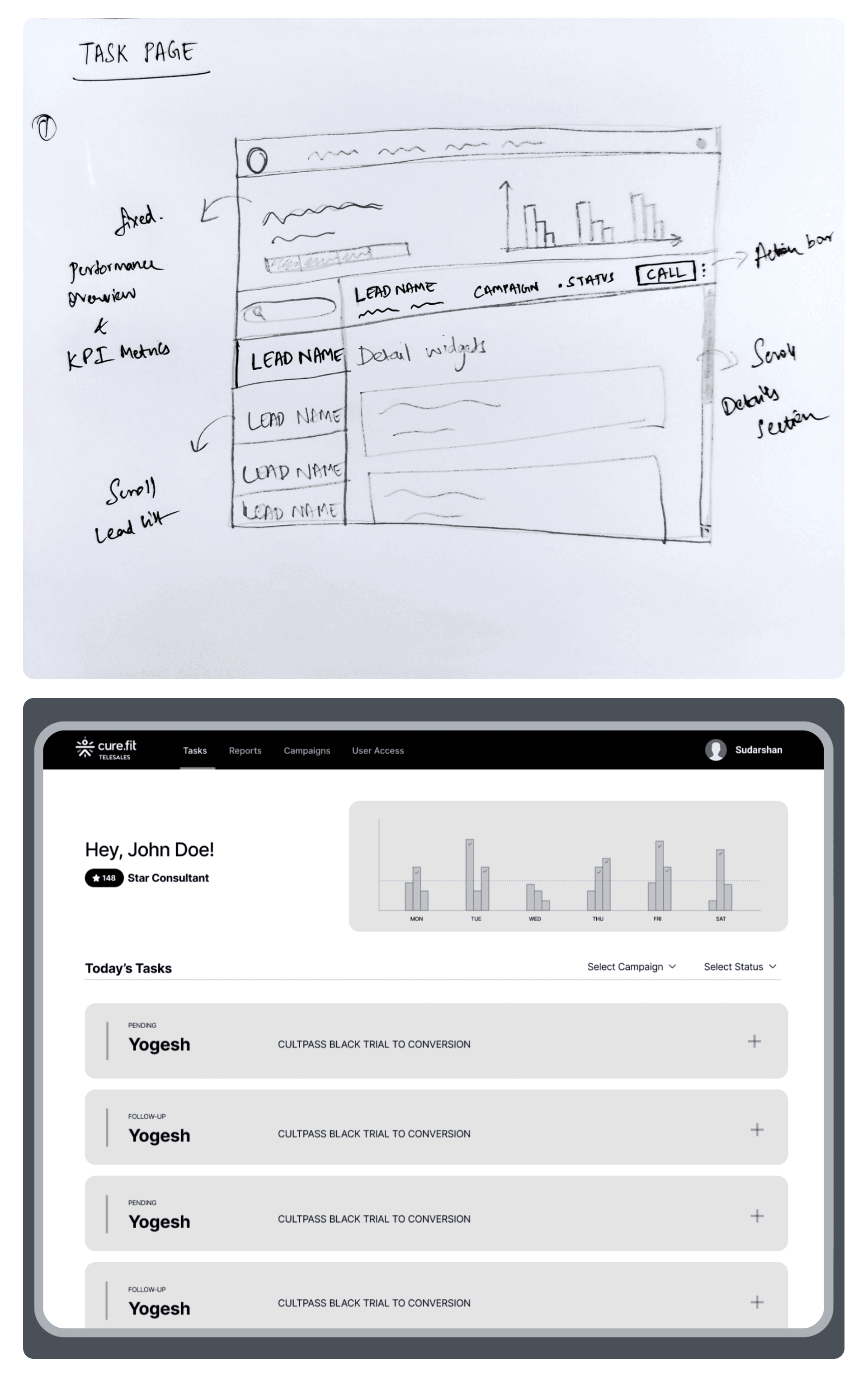
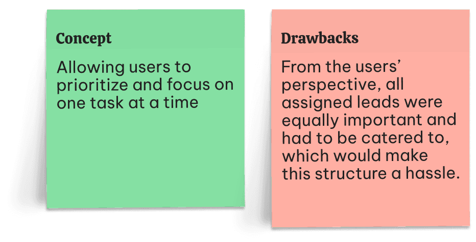
Exploration 1
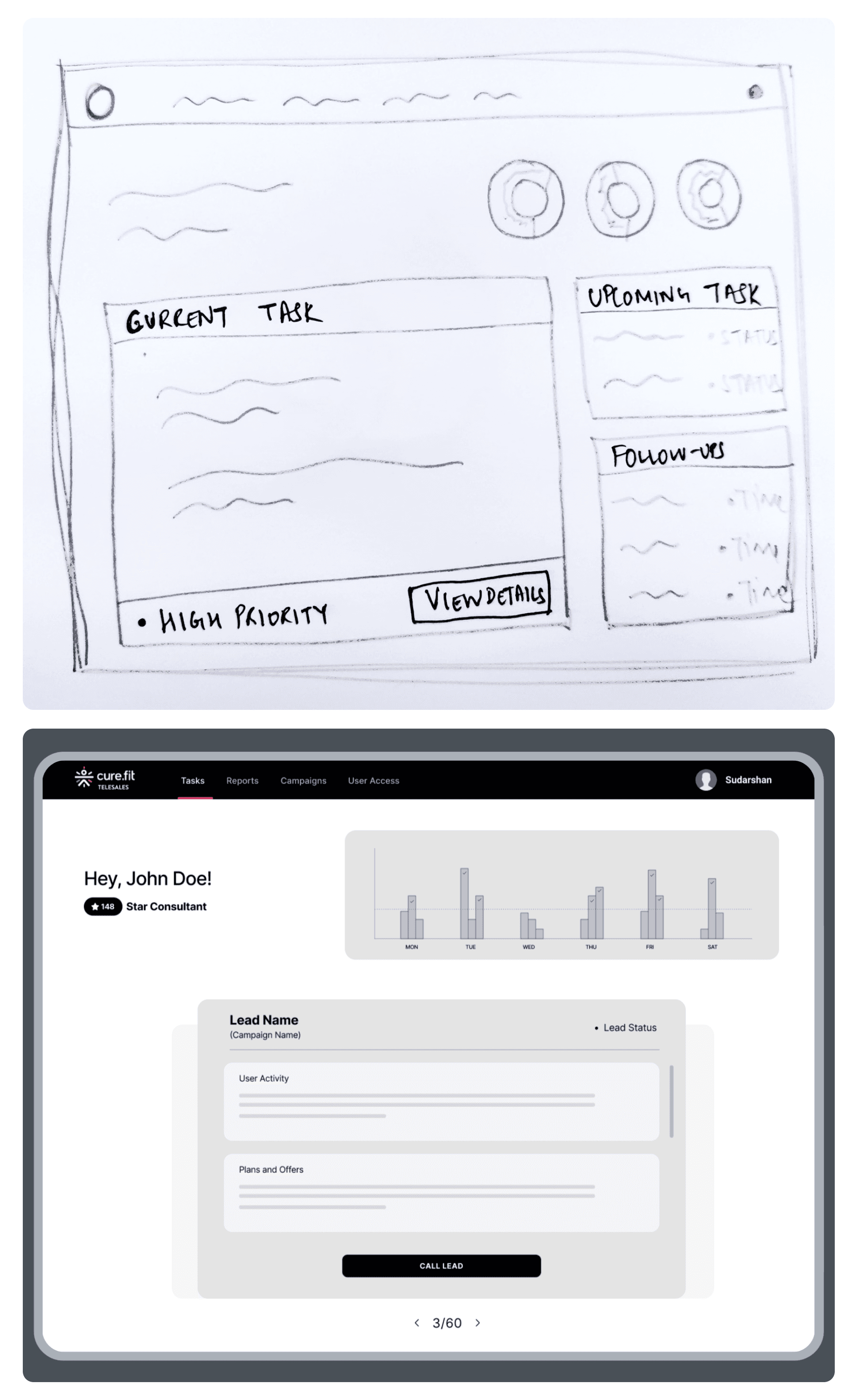
Exploration 2
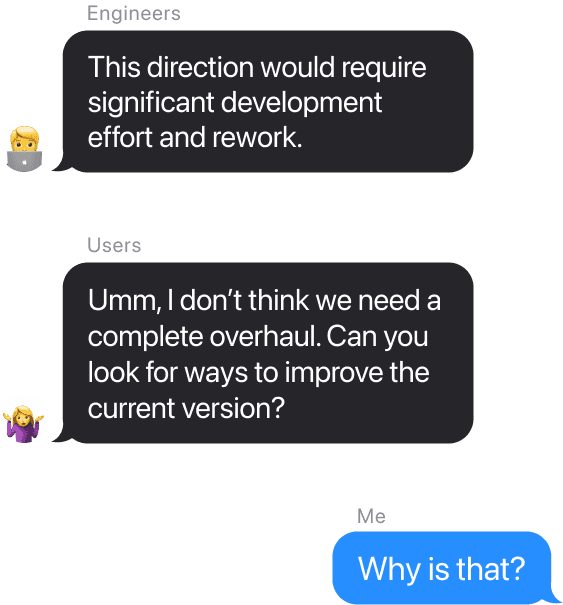
Learning from feedback
When I gathered feedback from the users, I learned that they didn’t want something radically different. Working in a high-stress environment like sales, users needed a tool that required minimal learning and adjustment time, while effectively simplifying their tasks.
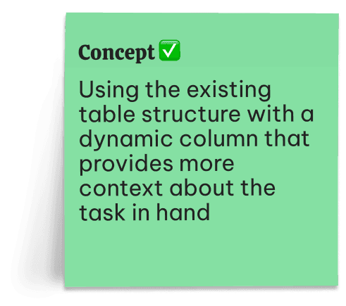
Understanding this, I pivoted to design solutions that respected the existing structure of the CRM. I focused on providing more contextual information within the familiar layout, ensuring that the tool enhanced their workflow without introducing unnecessary complexity.
Exploration 3
Final Designs
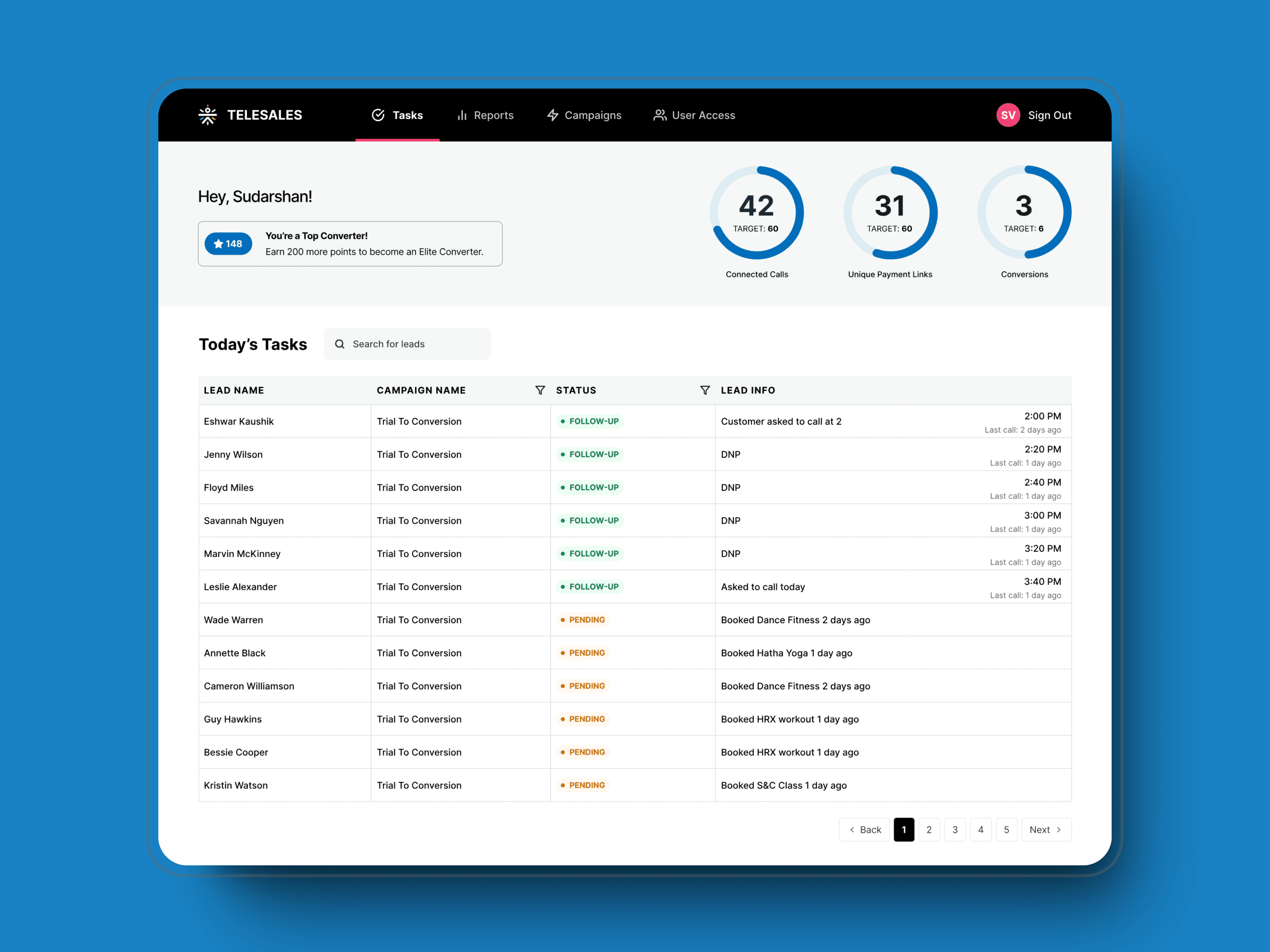
The new task page
I chose a design direction that struck the perfect balance between minimizing development time and effort while meeting the users' needs based on the feedback gathered. By incorporating minimal changes and preserving the existing structure, the design made it easier for users to accomplish their tasks efficiently. Additionally, it provided a way to reduce users' dependency on external tools like Excel sheets.
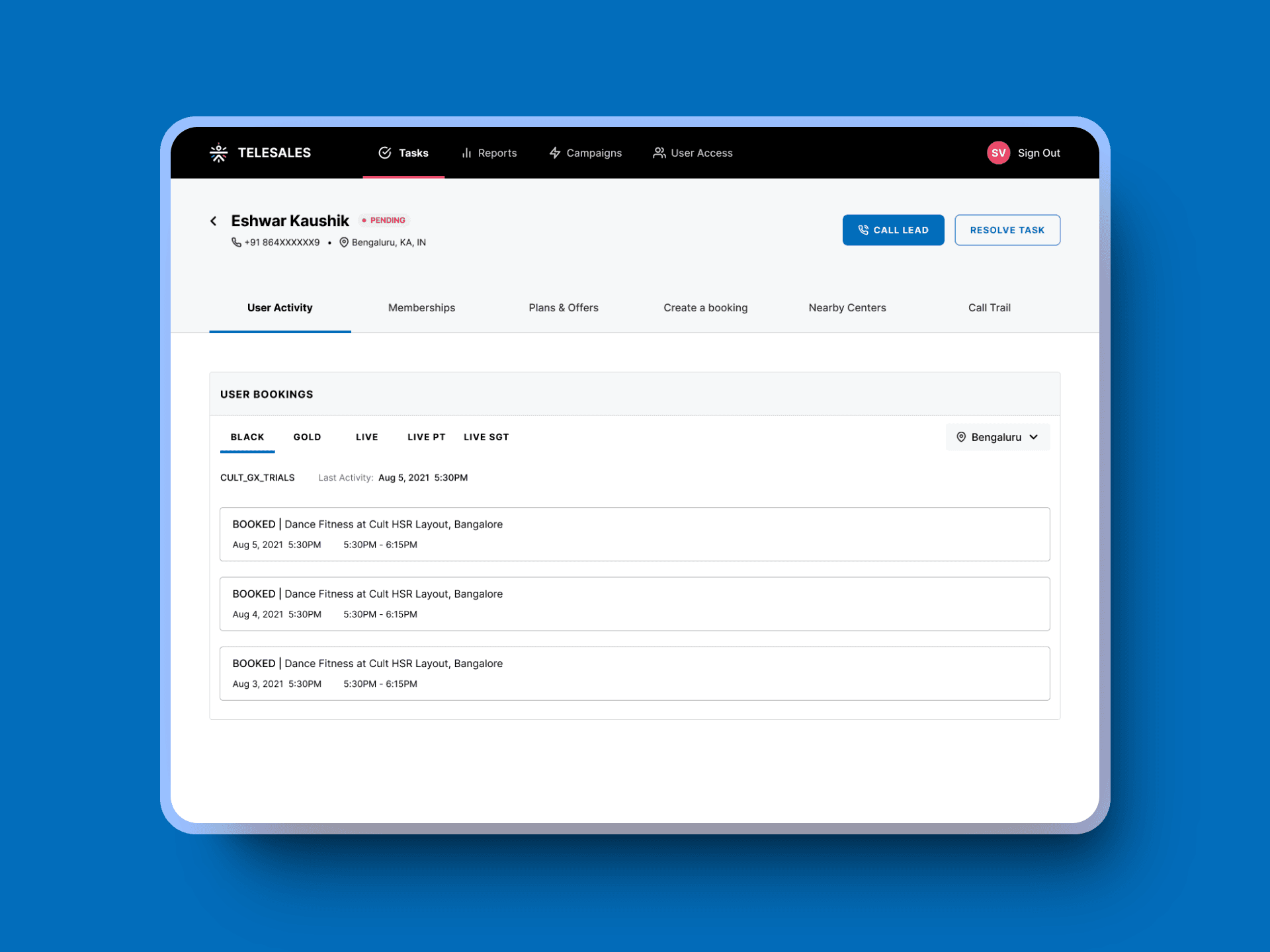
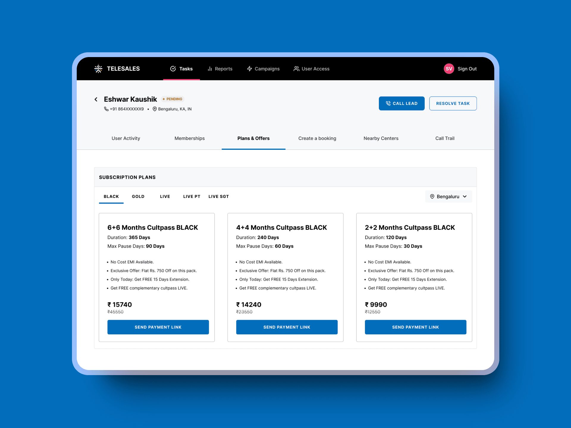
The new details page
The new details page was a significant improvement, providing users with comprehensive information about each customer. It included various widgets designed to support users during their interactions.
Reflections ✍️
You don’t always have to think outside the box. Sometimes, the solution lies within.
As designers, there’s a natural tendency to aim for bold, out-of-the-box solutions that showcase creativity and innovation. I’ve always been enthusiastic about experimenting and pushing the envelope when it comes to design. At the start of this project, I was eager to do the same—to deliver a groundbreaking solution that would prove my creative worth. This project taught me that impactful design isn’t always about radical, eye-catching changes. Sometimes, it’s about careful iteration and making targeted improvements that solve real pain points. It gave me firsthand insight into the balance between innovation and practicality—an invaluable lesson that has shaped my design approach since.
