What We Had
At the core, Cerebrum was a robust analytics platform that allowed the product team to pull and analyze user data and event analytics from our consumer app. The platform’s functionality was rich, and it enabled the product team to make data-driven decisions quickly and effectively.
However, for the wider audience, including non-technical users like growth marketers, the tool presented significant barriers to use.
The Problem
While the platform was well-equipped to generate analytics, it required users to write SQL queries to retrieve meaningful data—something not every user felt comfortable doing. This limited the tool’s effectiveness for users who didn’t have technical expertise.
Additionally, the platform produced single data points or analytics, which in isolation didn’t provide much value. What the users truly needed was the ability to combine multiple analytics that represented a full product flow or user experience.
Ideation and Early Explorations
Given the feedback from users, I realized that their main challenge was combining and visualizing multiple data points without relying on complex coding. With this in mind, I broke the problem into two core questions:
While the short answer was to give users the ability to build custom dashboards that aggregated different types of analytics, which would allow them to visualize multiple data points that made sense for their specific product flows, the bigger challenge was figuring out how to do this in a user-friendly way. To solve this, I broke it down further into two key goals:
Creating a Dashboard ✒️
The process had to be seamless, enabling users to select, combine, and filter data points through an intuitive interface.
Viewing the Dashboard 👁️
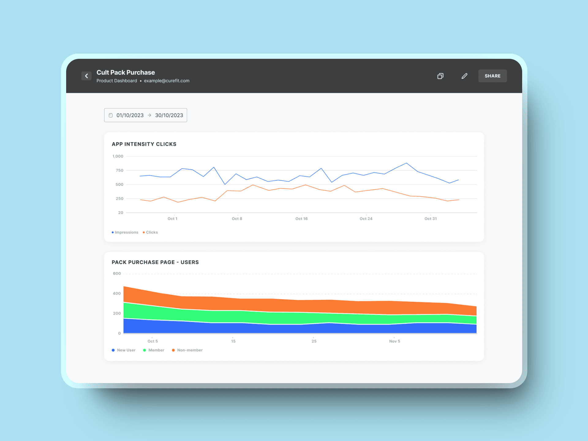
Once created, the dashboard needed to present the data in a digestible format, allowing users to draw insights effortlessly.
Creating a Dashboard
I chose to prioritize the dashboard creation process first since it required building from the ground up and posed the most complex challenges. My goal was to simplify how users combine and visualize multiple data points, and after researching several existing products, I was particularly inspired by the drag-and-drop interfaces in Intuit Mailchimp and Canva.
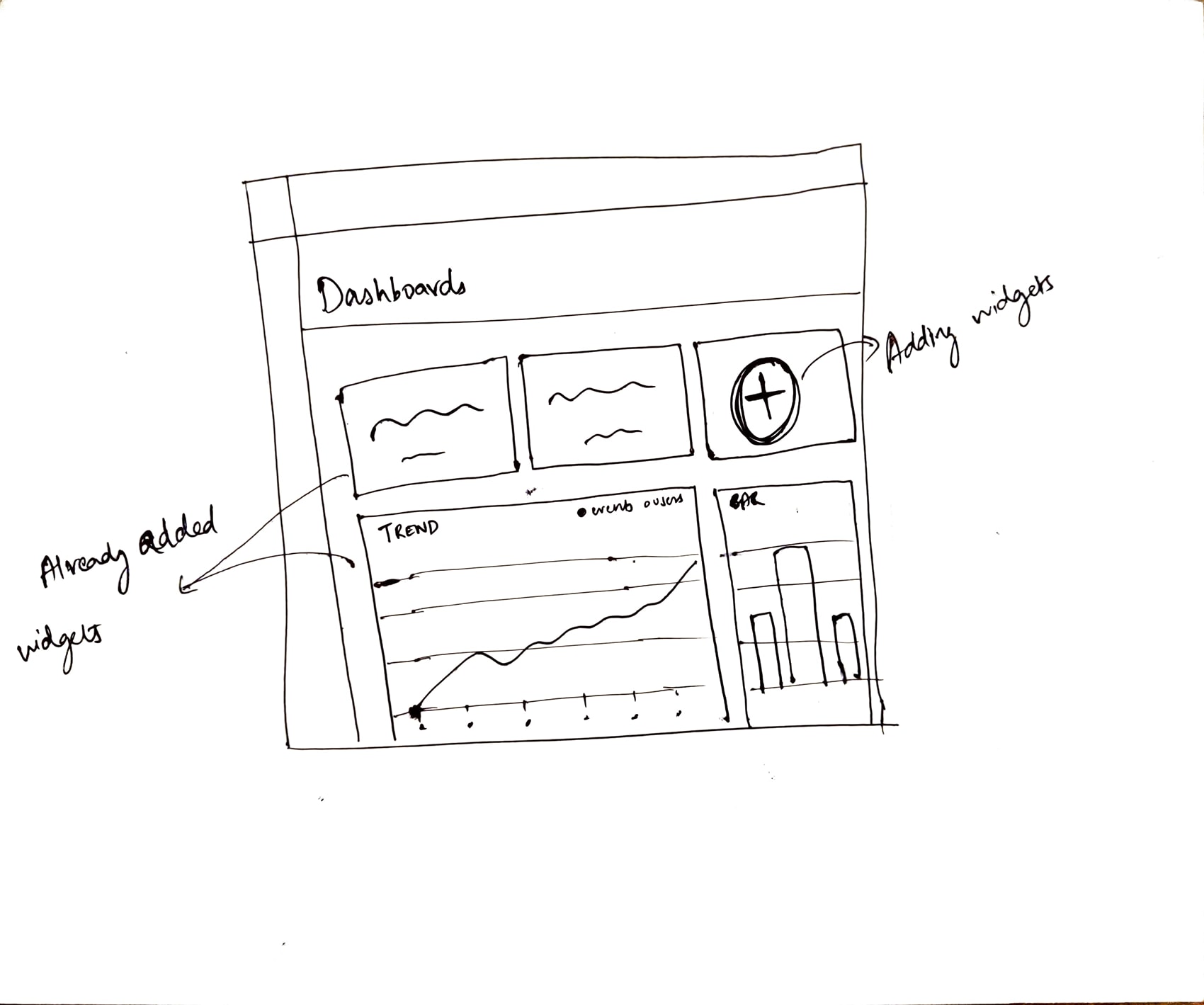
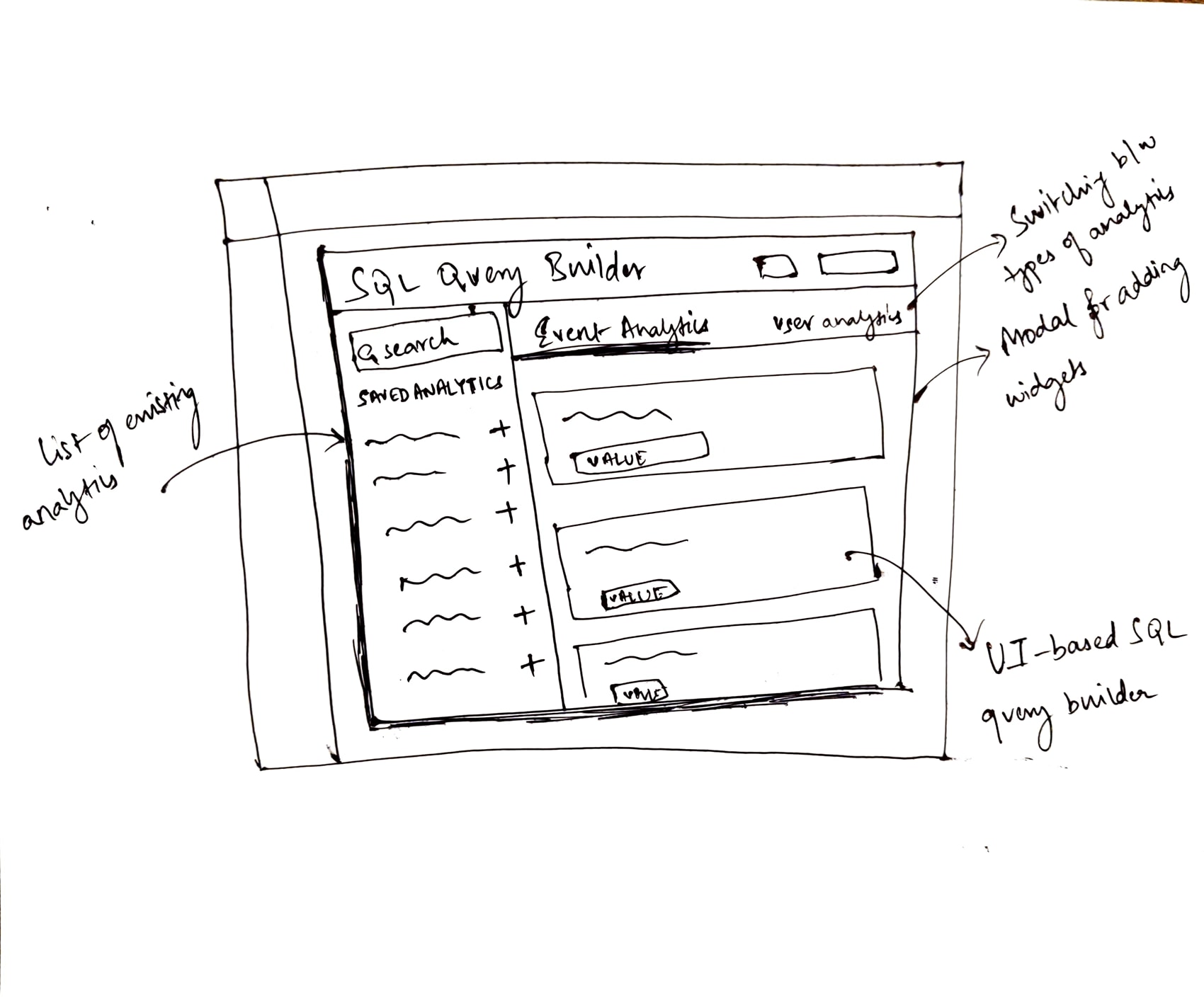
Both tools stood out because of their user-friendly approach to complex tasks. These platforms inspired me to envision a dashboard where users could drag and drop analytics widgets to create their own dashboards.
To materialize this vision, I crafted a detailed user flow that outlined each step in the dashboard creation process.
The Solution
The new dashboards section
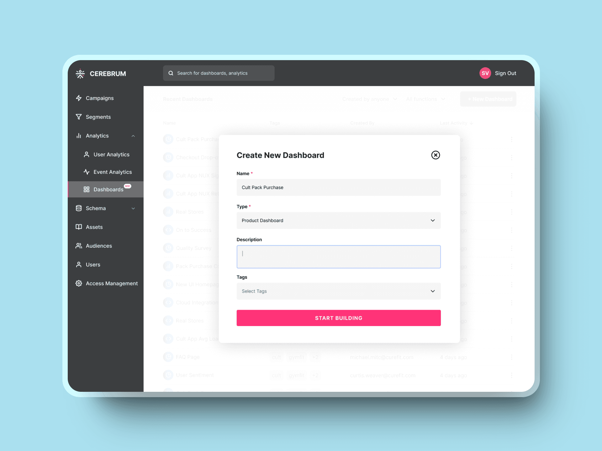
Housed within the analytics, the new dashboards section allows users to create, view and share dashboards that have important data points about the user within a particular product flow.
Creating a custom dashboard
An all-new drag-and-drop interface that allowed users to view all the available analytics that they can then drop into their own dashboard.


Reflections ✍️
Starting the Design Process Backwards
When I started this project, the stakeholders already had a clear vision for the final solution, which challenged the traditional design process I was familiar with. Although I had creative freedom, most of my effort was spent figuring out how to bring their ideas to life. This experience taught me that real-world design is rarely linear. Starting with a solution rather than the problem wasn’t easier either—it required its own process of understanding the rationale behind the vision and refining it to make it more user-centric. Ultimately, this project helped me realize that the design process is about adaptability, navigating constraints, and finding the best way to solve a problem, even if it means working backwards.


